| The Night Watch |
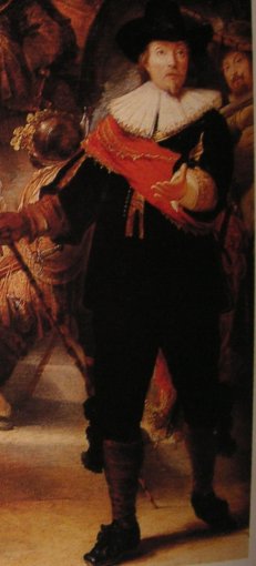
A supplement to the criticism of van de Wetering's "Rembrandt the Painter at Work": the need for the human dimension in Rembrandt criticismLet us compare the figure of Capt Banning Cocq in Rembrandt's Night Watch with Lunden's copy of the same. Lunden was a run-of-the-mill painter who made a good over-all copy of Rembrandt's most ambitious masterpiece. He presumably knew and used precisely the materials used by Rembrandt himself so it is only his sense of form which lets him down and it lets him down in a way which I think must be clear to all once it is pointed out. Rembrandt's figure is an amusing, penetrating portrait of a captain who is clearly not quite in command: he walks with a slightly drunken swagger. His expression seems to be asking 'why me?' In Lundens near copy none of this comes across - the Captain seems a much more solid and reliable citizen. The difference lies in very subtle differences in the over-all pose which can be perceived even in the two reproductions I have before me where the figures measure less than 9cm in height.(page 198 of "Rembrandt, the Painter at Work"). The difference in the quality of the pace each takes is very striking. It lies in the relationship of the legs and in the balance of the upper body over the legs. Rembrandt's man is nearly toppling backwards. If we compare detail with detail it is very difficult to see the difference but seen as a whole I guess anyone can see what I am talking about.
Looking at the heads, see how Rembrandt's contributes to the dynamic of the whole and Lundens does not. First the placing of the head on the shoulders is quite different, Lundens is more forward, more balanced, I guess a good 4cm further forward than that implied by Rembrandt in real space. Measured on the canvas the difference may be minute but its implications are great. Rembrandt has also divided the light from the dark much more decisively than Lunden which makes Lunden's version seem more pudding-like. Rembrandt cuts a plane of shadow down one side of the nose which continues through the mustache and into the beard. He cuts another plane in light on the other side of the beard which is again echoed in the larger mass of hair under the hat and in the lower part of the face adjacent to the beard. Rembrandt continues this planar geometry in the outer brim of the hat on either side, Lunden does not. Lunden's hat shows more crown and his collar is deeper, the direction of the opening of the collar in Rembrandt's implies a puffed chest beneath, Lundens does not. We find the same failures to catch Rembrandt's sense of space in the figure with the rifle to his left and in fact all over. Lundens must have used measurements across the surface of the canvas to place the parts and he looked carefully detail by detail but that is not accurate enough to catch Rembrandt's subtle meaning which is built on space geometry. Unless you read it as a whole, spacially you dont get it. This example is intended to demonstrate first that the interpretation of nature is not quite the job for simpletons that art historians seem to suppose. (Be assured that copying a painting is a good deal easier than 'copying nature'). Second it shows the spacial nature of Rembrandt's geometry, third and most importantly the necessity of considering the human context of Rembrandt's art. Rembrandt's vision depends on being seen as a whole and in its human context. Stylistic criticism has blinkered the minds and fogged the issues. In his book, Van de Wetering puts his finger on the root cause of the Rembrandt disaster when he contrasts the critical methods of Hoogstraten (one of Rembrandt's students) with that of Wolfflin (the modern method) on page 181. He says Wolfflin's 'abstract pictorial catagories can be appreciated without reference to any depiction of reality'. In other words Wolfflin's limited vision has no room for the discussion of Rembrandt's greatness. Hoogstraten's ideas writes van de Wetering "hold not the slightest appeal within the conceptual framework we have constructed around the phenomenon of style." Rembrandt has all but disappeared under the impact of stylistic criticism because he does not conform in the very least to the ideas we have constructed around the phenomenon of style an excellent reason for abandoning those ideas. Alas too many scholars have committed too much of their effort to creating a new image of Rembrandt for them to be able to change course. We must insist that they do. |
|||


